Catch Christmas On a Color Wheel! (Complementary Colors)
A Christmas Art Lesson
What is the Christmas season without contrasts? To counter the long dark nights, we hang thousands of twinkling lights. To counter the icy cold, we enjoy hot chocolate, hot soups, and crackling fires. To counter the grey winter skies, we decorate with strong color contrasts—red and green.
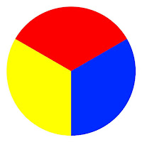
What makes the contrast of red and green so exciting? The color wheel holds the answer. You probably already know that there are three primary colors: red, yellow, and blue, and that by mixing these three colors—and by adding black and white—we can get all the other colors.
|
|
|
Primary colors
|
A simple color wheel shows the three primaries and the three secondary colors we get by mixing them together.
|

|
|
Primaries and secondaries
|
|

|
|
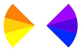
Analogous cool colors
|
|

|
|
Analogous warm colors
|
If we paint a picture with two analogous colors (colors right next to each other on the color wheel) we can create a particular feeling. If you paint a picture with red and orange, for example, you get a warm picture. Paint a picture with blue and green, or blue and purple, and you get a cold picture.
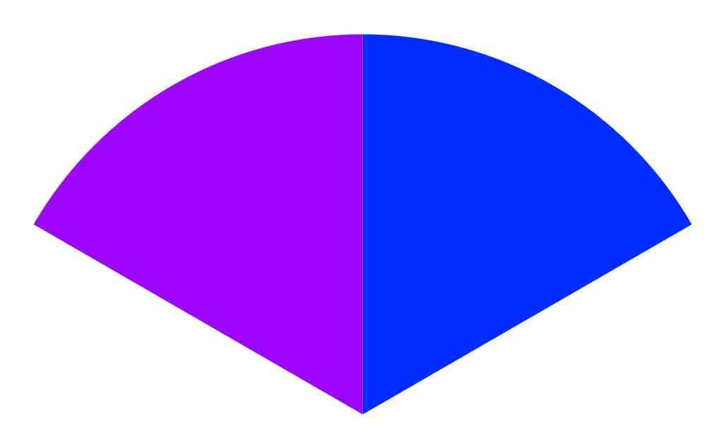
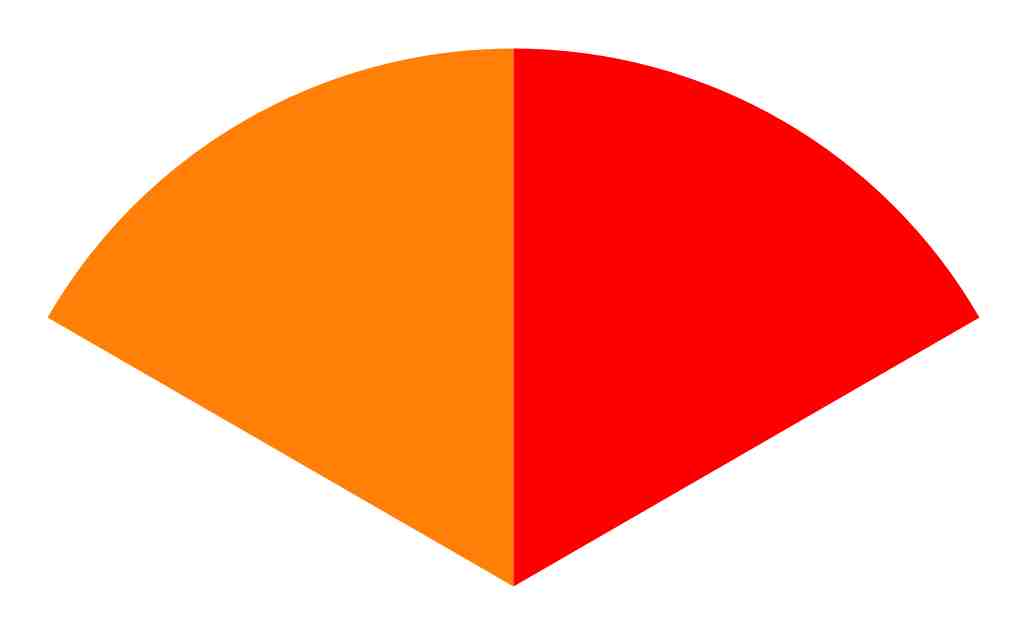
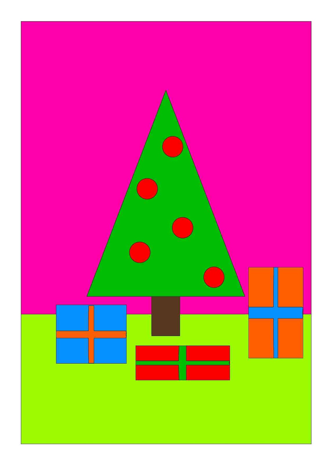
But what happens when you make a picture from opposite sides of the color wheel—with complementary colors? YOU GET EXCITEMENT! That’s why it’s so common to decorate green Christmas trees with red ornaments. That’s a color combination that dispels gloom!
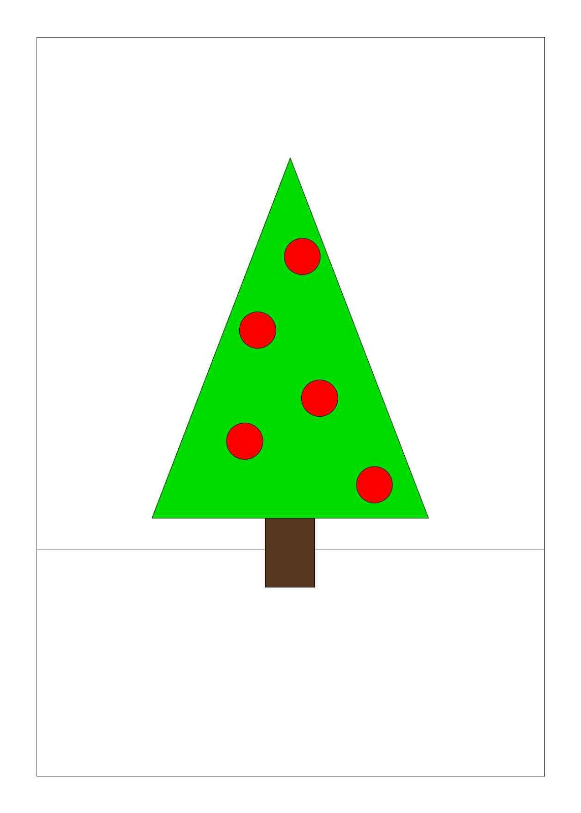
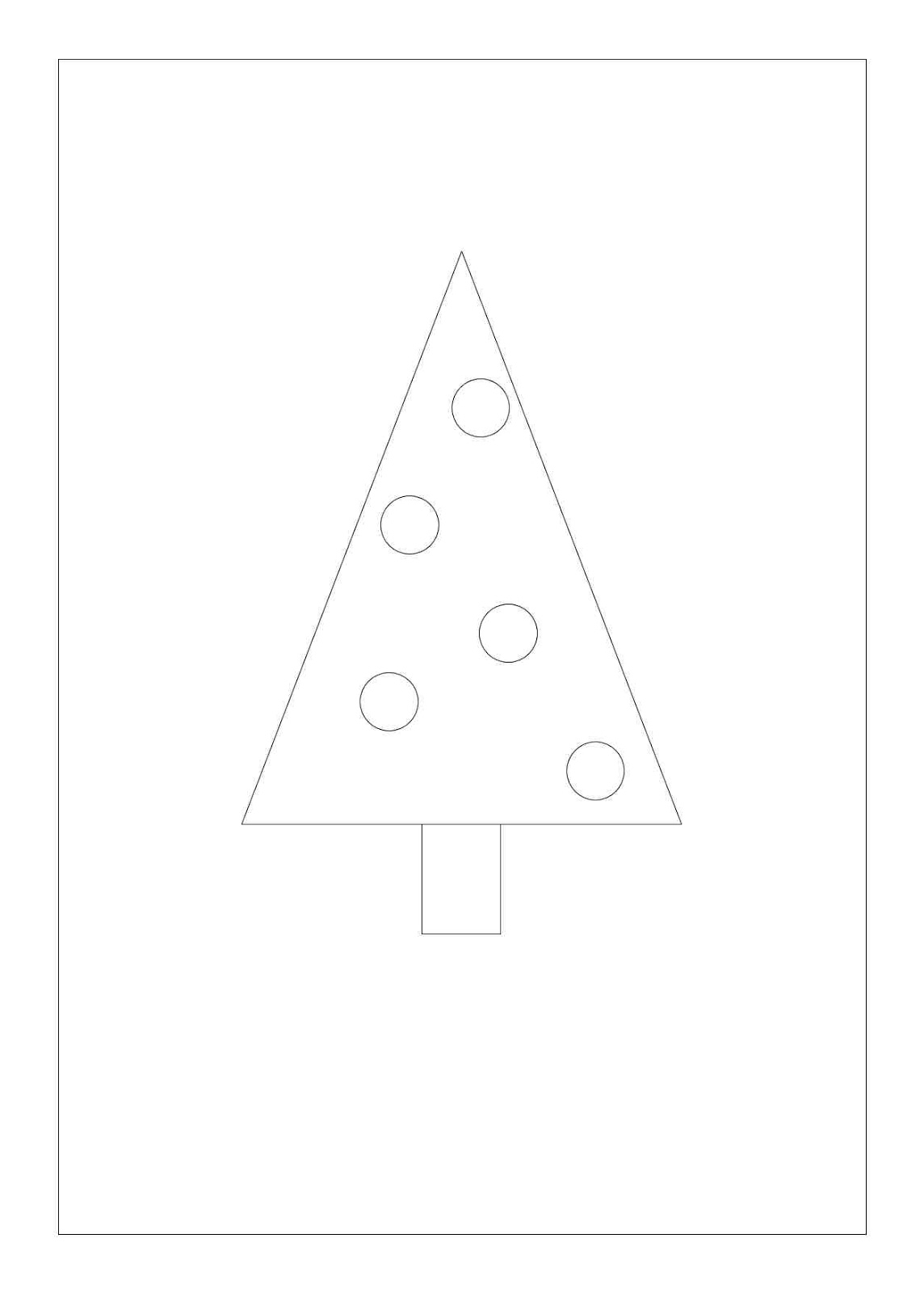
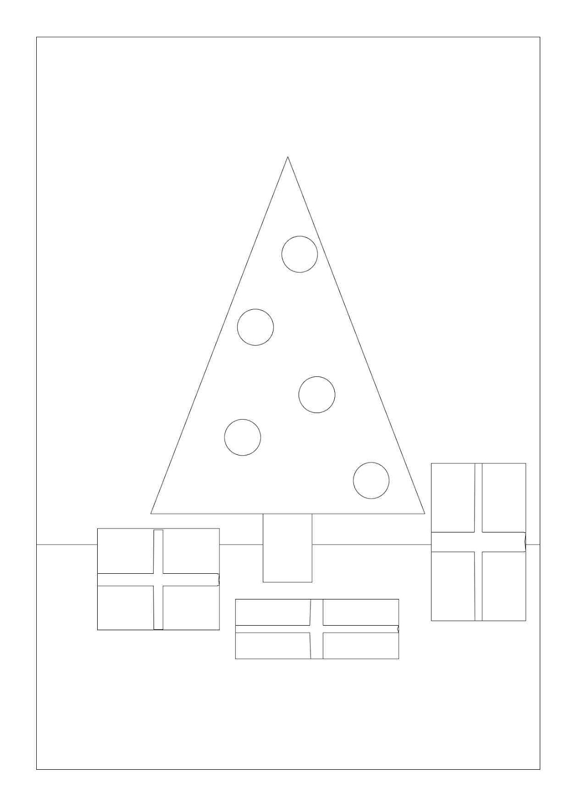
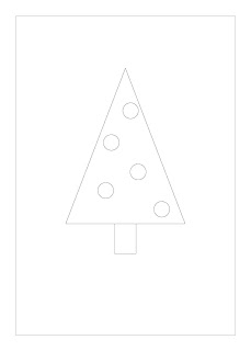
Let’s explore how we can exploit complementary colors to make a very simple—but visually exciting—picture. Start by drawing a simple evergreen tree—a triangle mounted on a rectangle—on an 8” x 5 1/2” paper. Draw a few circles for the ornaments—there’s no need to make the drawing complicated at the point.
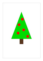
Use crayons or markers to color the tree with the traditional complementary colors, red and green. Use a neutral color like brown or black for the trunk.
Then draw a line for where the wall meets the floor. It’s when you add colors to these spaces that the excitement grows!

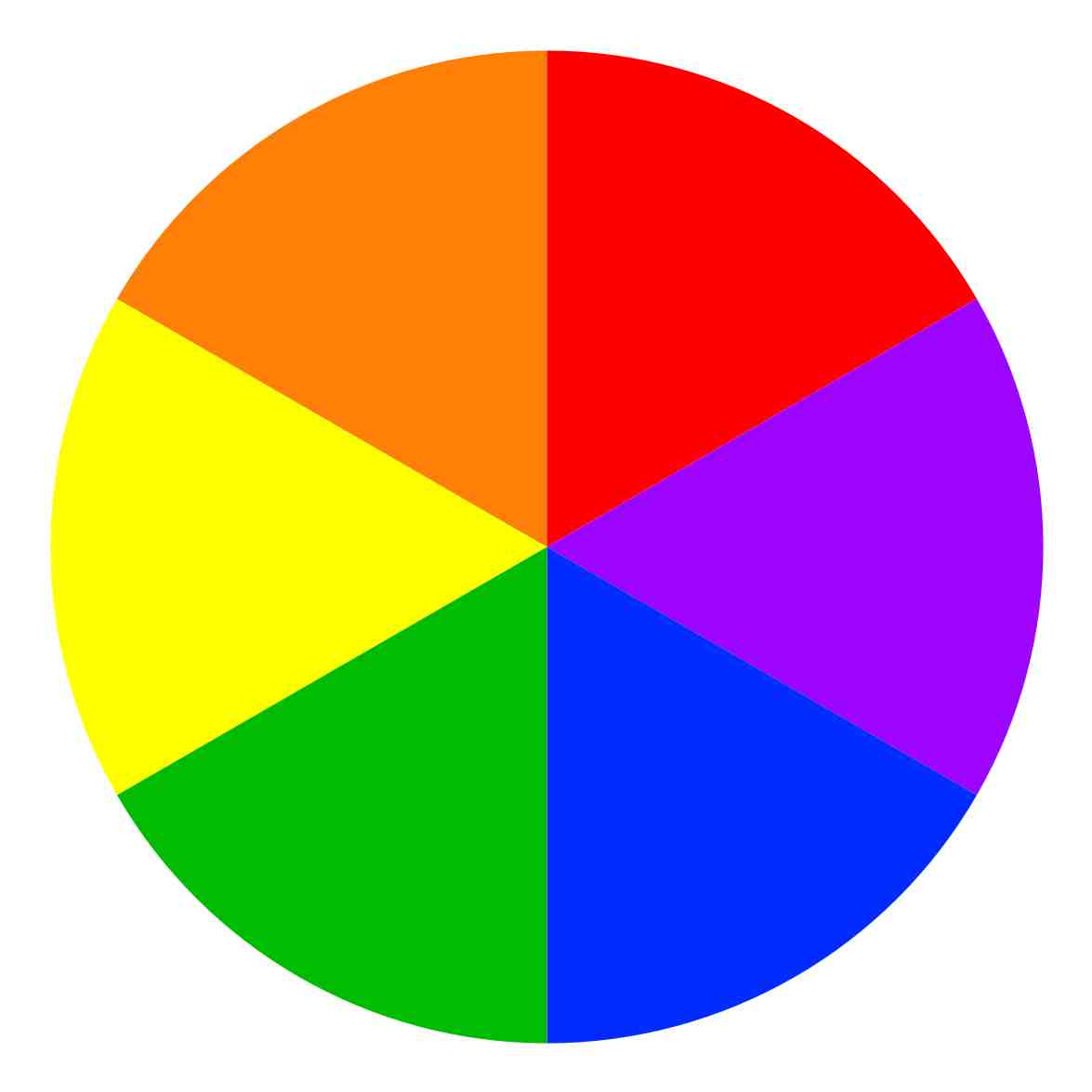
But before you color these two spaces, take time to learn a little more about the color wheel. Let’s combine the colors in our 6-color wheel to make tertiary colors.
|

|
|
Primary, secondary and tertiary colors
|
|
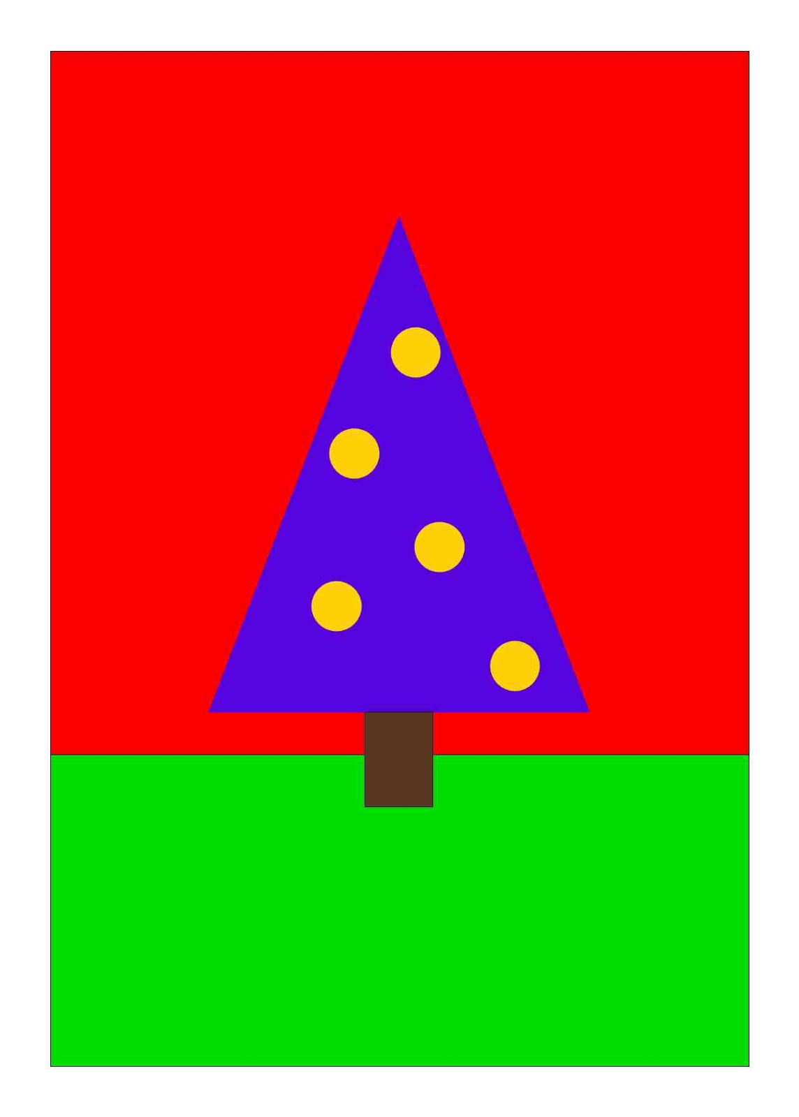
Choose two complementary colors from this new color wheel to color the two spaces of the wall and floor (no need to choose the same colors as are in the example!).

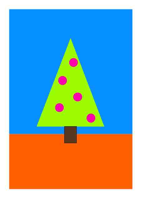
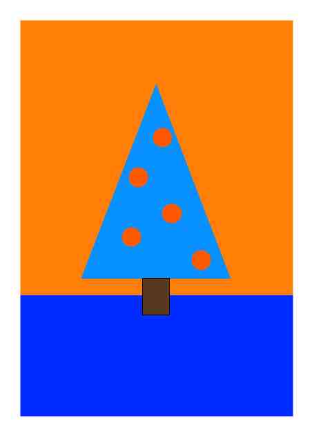
Then draw a new drawing with the same tree, the same ornaments, and the same line for the background. Use the same four colors, but put them in new locations.

Draw a third and fourth tree, and choose two new sets of complementary colors for each new picture. Choose your own sets of colors—the only requirement is to choose complementary colors. Which combination of colors do you like best? Which seems most vibrant to you?


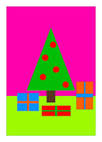
Putting in two sets of complementary colors can create an exciting result, but what happens if we make the picture more complicated? Let’s draw a new picture to find out. Draw another picture of the tree and add presents. Be sure to draw lines for the ribbon.

If we add too many sets of complementary colors, the picture can end up looking busy or overdone instead of exciting. Eventually we have used so many combinations of complimentary colors that we have used the whole color wheel, and the excitement is lost.

How can we make a complex picture that uses several colors and still make the colors exciting? The answer, again, is in the color wheel. Remember that complementary colors are the most exciting colors, so when we need several colors for our picture, we should choose colors from opposite sides.
In other words, the most exciting choice will be to choose analogous colors (colors right next together) from one side of the color wheel—and contrast them with analogous colors from the opposite side of the wheel. This way, we will still have the exciting feel of a picture with complementary colors.

Try coloring the drawing you made of the tree and presents using three analogous and their three complements. No matter what colors you choose, the result will be a vibrant picture!
For extra fun, make a set of four drawings of the tree with presents, and then choose a different set of colors for each. Make sure to chose three analogous colors and their complementary colors for each picture. Put them side by side for a dazzling holiday display! Or choose your favorite picture and get it printed as a Christmas card!
Once you have experimented with using complementary colors to add excitement to the holidays, you will want to try more complicated drawings.
Treat yourself to an art lesson that will let you have even more fun playing with colors!
A Christmas Art Lesson
What is the Christmas season without contrasts? To counter the long dark nights, we hang thousands of twinkling lights. To counter the icy cold, we enjoy hot chocolate, hot soups, and crackling fires. To counter the grey winter skies, we decorate with strong color contrasts—red and green.
What makes the contrast of red and green so exciting? The color wheel holds the answer. You probably already know that there are three primary colors: red, yellow, and blue, and that by mixing these three colors—and by adding black and white—we can get all the other colors.
|
|
|
Primary colors
|
A simple color wheel shows the three primaries and the three secondary colors we get by mixing them together.
|
|
|
Primaries and secondaries
|
|
|
|
Analogous cool colors
|
|
|
|
Analogous warm colors
|
If we paint a picture with two analogous colors (colors right next to each other on the color wheel) we can create a particular feeling. If you paint a picture with red and orange, for example, you get a warm picture. Paint a picture with blue and green, or blue and purple, and you get a cold picture.
But what happens when you make a picture from opposite sides of the color wheel—with complementary colors? YOU GET EXCITEMENT! That’s why it’s so common to decorate green Christmas trees with red ornaments. That’s a color combination that dispels gloom!
Let’s explore how we can exploit complementary colors to make a very simple—but visually exciting—picture. Start by drawing a simple evergreen tree—a triangle mounted on a rectangle—on an 8” x 5 1/2” paper. Draw a few circles for the ornaments—there’s no need to make the drawing complicated at the point.
Use crayons or markers to color the tree with the traditional complementary colors, red and green. Use a neutral color like brown or black for the trunk.
Then draw a line for where the wall meets the floor. It’s when you add colors to these spaces that the excitement grows!
But before you color these two spaces, take time to learn a little more about the color wheel. Let’s combine the colors in our 6-color wheel to make tertiary colors.
|
|
|
Primary, secondary and tertiary colors
|
|
Choose two complementary colors from this new color wheel to color the two spaces of the wall and floor (no need to choose the same colors as are in the example!).
Then draw a new drawing with the same tree, the same ornaments, and the same line for the background. Use the same four colors, but put them in new locations.
Draw a third and fourth tree, and choose two new sets of complementary colors for each new picture. Choose your own sets of colors—the only requirement is to choose complementary colors. Which combination of colors do you like best? Which seems most vibrant to you?
Putting in two sets of complementary colors can create an exciting result, but what happens if we make the picture more complicated? Let’s draw a new picture to find out. Draw another picture of the tree and add presents. Be sure to draw lines for the ribbon.
If we add too many sets of complementary colors, the picture can end up looking busy or overdone instead of exciting. Eventually we have used so many combinations of complimentary colors that we have used the whole color wheel, and the excitement is lost.
How can we make a complex picture that uses several colors and still make the colors exciting? The answer, again, is in the color wheel. Remember that complementary colors are the most exciting colors, so when we need several colors for our picture, we should choose colors from opposite sides.
In other words, the most exciting choice will be to choose analogous colors (colors right next together) from one side of the color wheel—and contrast them with analogous colors from the opposite side of the wheel. This way, we will still have the exciting feel of a picture with complementary colors.
Try coloring the drawing you made of the tree and presents using three analogous and their three complements. No matter what colors you choose, the result will be a vibrant picture!
For extra fun, make a set of four drawings of the tree with presents, and then choose a different set of colors for each. Make sure to chose three analogous colors and their complementary colors for each picture. Put them side by side for a dazzling holiday display! Or choose your favorite picture and get it printed as a Christmas card!
Once you have experimented with using complementary colors to add excitement to the holidays, you will want to try more complicated drawings.
Treat yourself to an art lesson that will let you have even more fun playing with colors!