Having Trouble With Oil Pastels? The Problem May Be the Paper
Our neighbor uses ArtAchieve art lessons in her 6th grade classroom, and often drops by our house to show off her students’ latest achievements.
This week she came over again, a stack of student art work in hand, but rather than show off her students’ work, she wanted to tell me how frustrated her students were.
Here is the problem the kids faced. They were using the Level I art lesson: Four Suns With Four Faces. The lesson suggests that students use oil pastels and shows how to blend them.
|
|
|
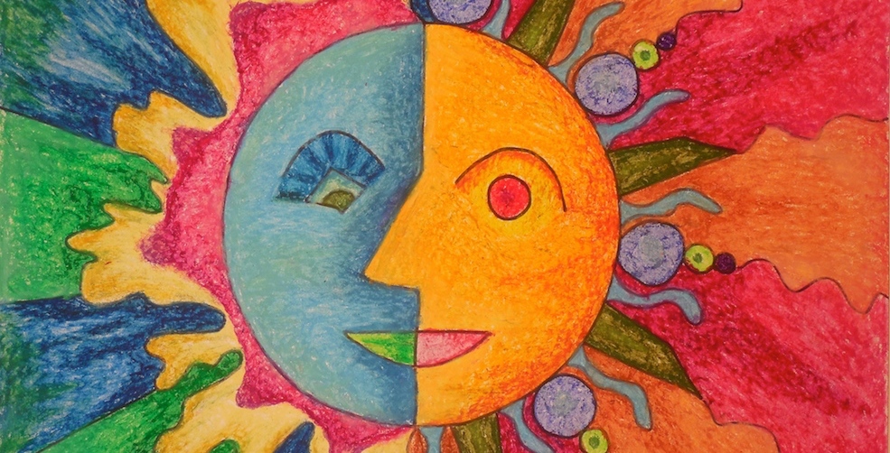
The picture that appears in the art lesson
|
The problem this class faced was with blending. The lesson suggests that people use an eraser or a fingertip to blend colors together, but for this class, the blending turned out to be impossible.
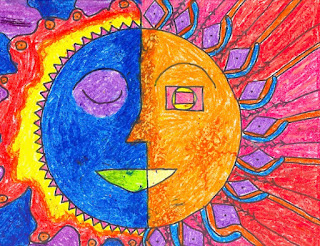
“Here,” said my disappointed teacher/neighbor. “Look at these. America was trying so hard, and look how blotchy that picture turned out to be.
|
|
|
America's sun
|
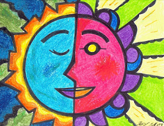
"And look at that cheek on Angelina’s sun. It looks like she didn’t blend it at all, but she really tried!"
|
|
|
Angelina's sun
|
"Carlie got the blending to work a little, but even his looks rough.”
|

|
|
Carlie's sun
|
“What did we do wrong?” With that she handed the papers to me.
Problem #1
As soon as I touched the paper, I knew the main problem: it was the paper. It had a very smooth, almost slick feel.
So I explained, “Your paper has no tooth.”
The paper I had used in the example was some inexpensive drawing paper, but it had a nice “drawing paper” roughness. We sometimes refer to that roughness as the paper’s “tooth.” The tooth on the paper “bites” the oil pastel and holds the pigment on the tip of the “teeth.”
|

|
|
The paper I had used
|
When we blend the pastels, we are rubbing the pigment from one tooth to another, and the pigment slips down into tiny valleys between the teeth. That helps to make the blending easy.
Problem #2
The second thing that went wrong is that the students applied the first coating of oil pastels too heavily. It’s better to let the first layer of color be rather light. If you color with wiggly, erratic patterns, rather than scrubbing a thick coat into the paper, there is room on the “teeth” to catch other colors later, making the blending process easier.
If you follow these two principles
-
using paper with a bit of tooth, and
-
applying the first layer of color with a light, erratic stroke,
you should find that oil pastels are easy to blend, and will reward your effort with their rich, brilliant color.
Practice what you've just learned with the art lessons Four Suns With Four Faces. Get started here!
Our neighbor uses ArtAchieve art lessons in her 6th grade classroom, and often drops by our house to show off her students’ latest achievements.
This week she came over again, a stack of student art work in hand, but rather than show off her students’ work, she wanted to tell me how frustrated her students were.
Here is the problem the kids faced. They were using the Level I art lesson: Four Suns With Four Faces. The lesson suggests that students use oil pastels and shows how to blend them.
|
|
|
The picture that appears in the art lesson
|
The problem this class faced was with blending. The lesson suggests that people use an eraser or a fingertip to blend colors together, but for this class, the blending turned out to be impossible.
“Here,” said my disappointed teacher/neighbor. “Look at these. America was trying so hard, and look how blotchy that picture turned out to be.
|
|
|
America's sun
|
"And look at that cheek on Angelina’s sun. It looks like she didn’t blend it at all, but she really tried!"
|
|
|
Angelina's sun
|
"Carlie got the blending to work a little, but even his looks rough.”
|
|
|
Carlie's sun
|
“What did we do wrong?” With that she handed the papers to me.
Problem #1
As soon as I touched the paper, I knew the main problem: it was the paper. It had a very smooth, almost slick feel.
So I explained, “Your paper has no tooth.”
The paper I had used in the example was some inexpensive drawing paper, but it had a nice “drawing paper” roughness. We sometimes refer to that roughness as the paper’s “tooth.” The tooth on the paper “bites” the oil pastel and holds the pigment on the tip of the “teeth.”
|
|
|
The paper I had used
|
When we blend the pastels, we are rubbing the pigment from one tooth to another, and the pigment slips down into tiny valleys between the teeth. That helps to make the blending easy.
Problem #2
The second thing that went wrong is that the students applied the first coating of oil pastels too heavily. It’s better to let the first layer of color be rather light. If you color with wiggly, erratic patterns, rather than scrubbing a thick coat into the paper, there is room on the “teeth” to catch other colors later, making the blending process easier.
If you follow these two principles
-
using paper with a bit of tooth, and
-
applying the first layer of color with a light, erratic stroke,
you should find that oil pastels are easy to blend, and will reward your effort with their rich, brilliant color.
Practice what you've just learned with the art lessons Four Suns With Four Faces. Get started here!